Connect'In Tutorials - Time Series Graph
Create a short description or engaging message to motivate your audience to take action
Graph Creation
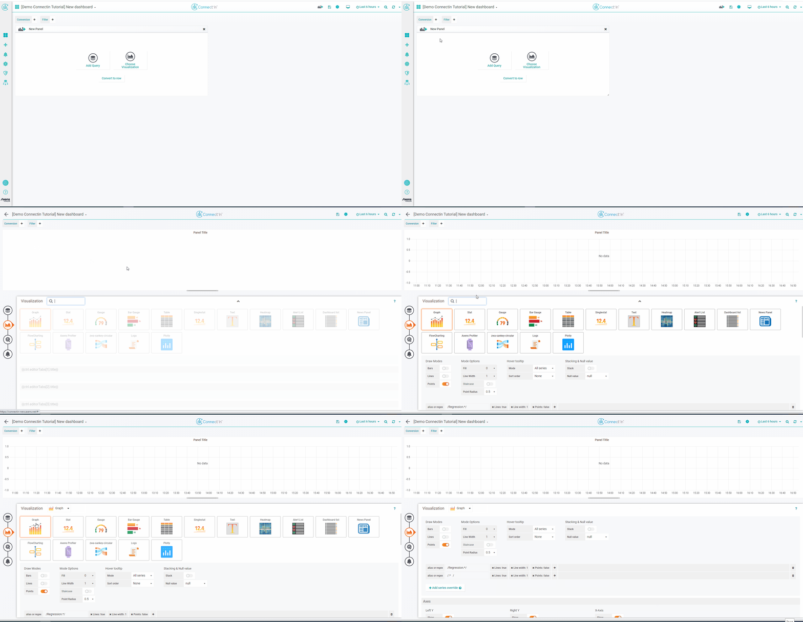
To add a time-series graph, click on add panel icon. A "New Panel" should appear on the dashboard, click on choose visualization. Look for the Graph card (should be the first one). This adds a time-series graph panel.
Graph Legends
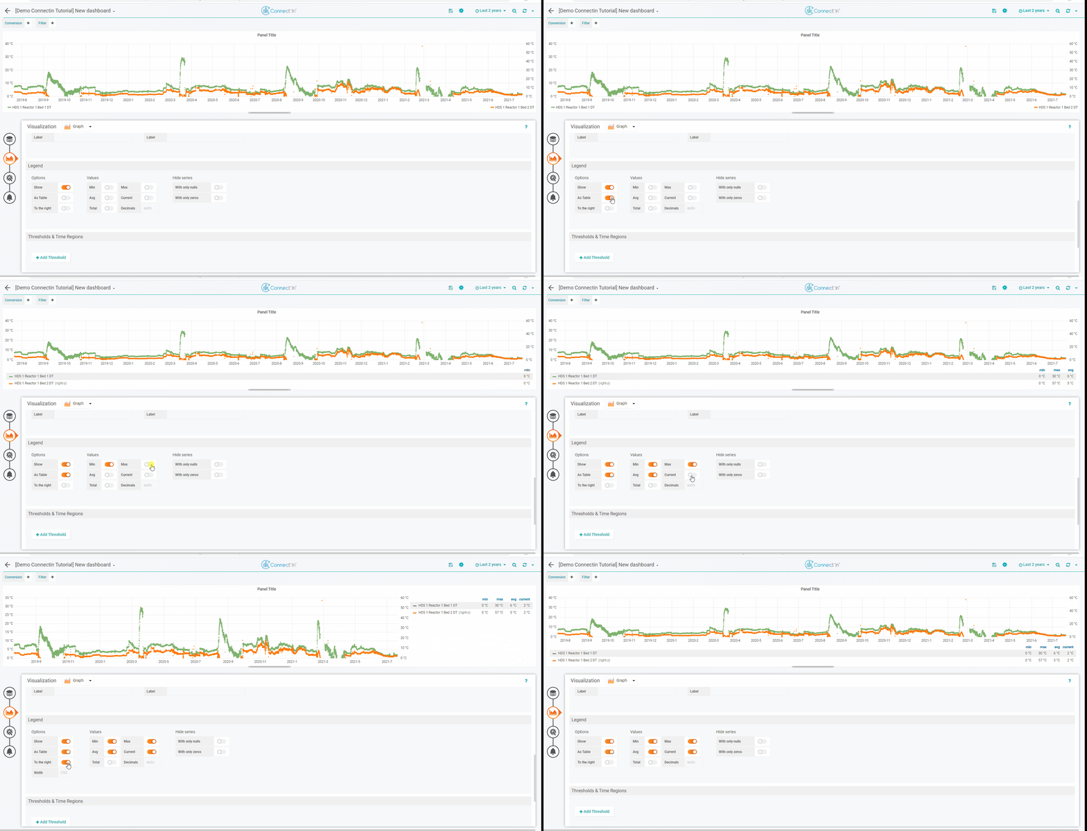
To display graph legends as a table, go to the "Legend" settings in the Visualization Tab.
Click on the switch "As Table". This displays the legends as a table. You also have the options to show different aggregations of the data, such as "min","max","average" and "current" by turning the respective switches on.
You can also click on "to the right" to display the table in the right hand side of the graph.
Graphs with Vertical Bars / Stacked Graphs
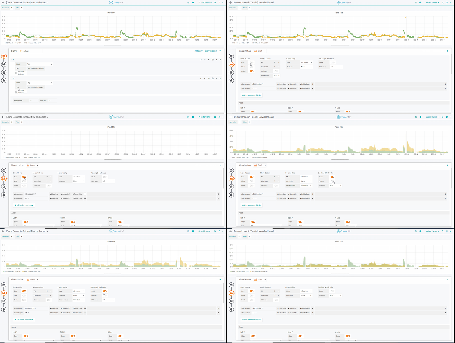
To display graphs with vertical bars. In the visualization tab, go to "Draw Modes" and activate the switch "bars".
To stack different series on top of each other, click on "Stack" switch. If you wish to show everything as a percentage, click on "Percent" switch after stack is activated.
Disable a Tag from being Displayed
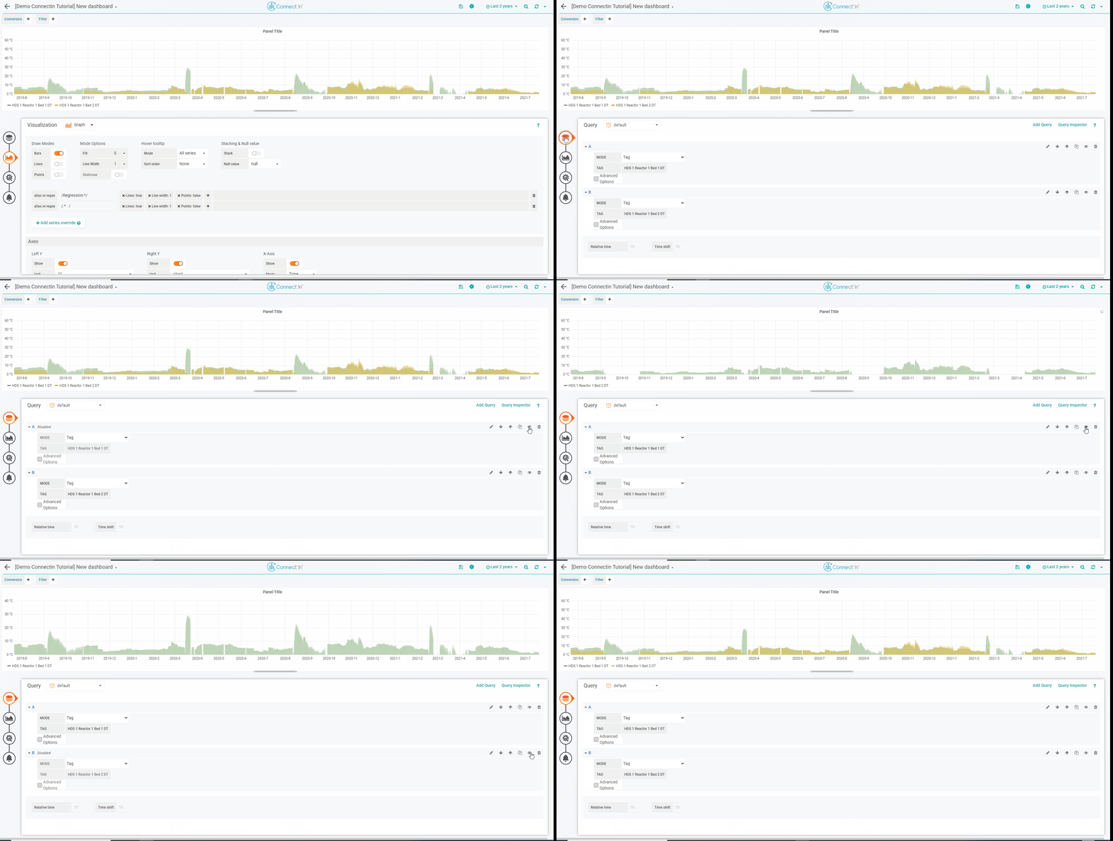
To disable a tag from being displayed, go to the Query tab.
For each query, you will find an eye symbol on the right hand side. By clicking on the eye symbol, you can show/hide the corresponding tag from displaying.
Changing Colours
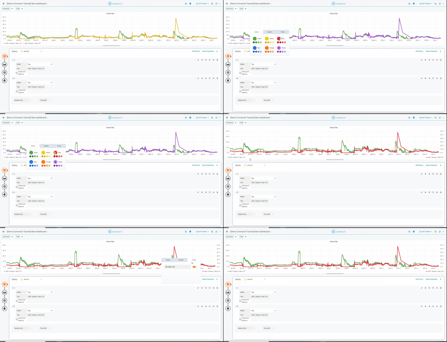
To change the trend color, click on the little color bar next to the tag name in the legend. A pop-up will show up offering different color options. Select the color that you want. You'll have also other options such as displaying series with the right y-axis.
Graphing a Constant Value
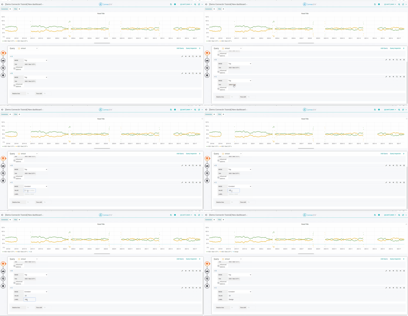
To add a series of a constant value, add a new query. Then in the mode, select "Constant" for the mode. Give a value for the constant, give a label if desired..
