Connect'In Tutorials- Dashboards
Create a short description or engaging message to motivate your audience to take action
Create a Dashboard
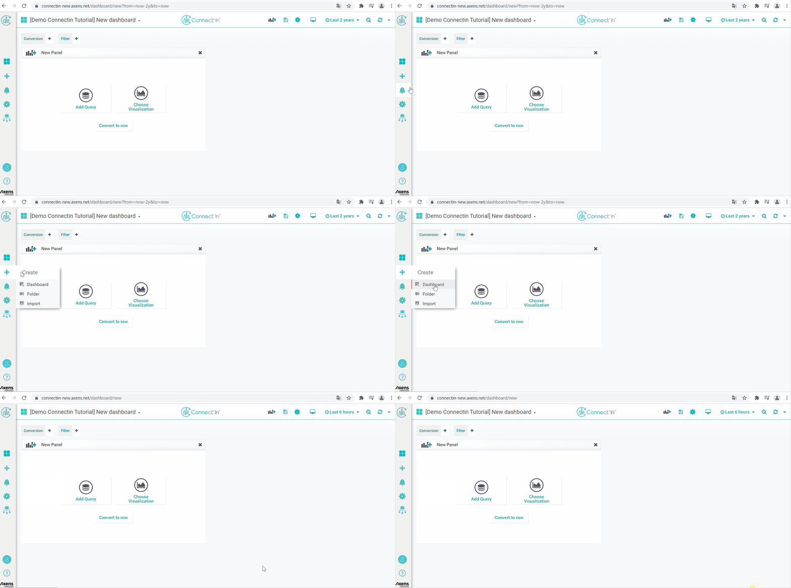
To create a "Dashboard", click on the "+" sign shown on the left navigation bar, then choose Dashboard.
Define Dashboard as Home Page
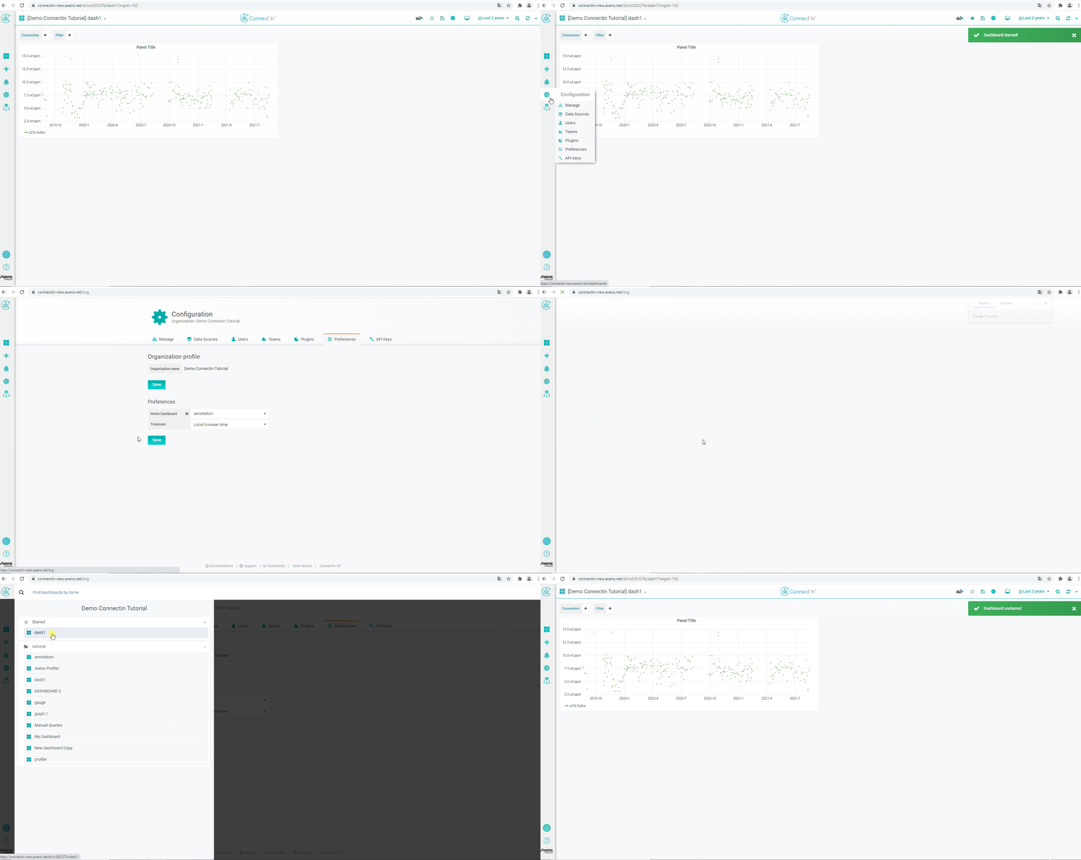
To define a dashboard as the homepage of a unit, first, go to the dashboard you wish to define as the homepage.
On the upper right hand corner, click on the star symbol to mark the dashboard as a favorite. Then go to configurations (gear icon on the left hand navigation bar), go to Preferences.
You should see a dropdown selection next to the "Home Dashboard" field. Select the starred dashboard as the home dashboard.
Organize Panels into Sections with Rows
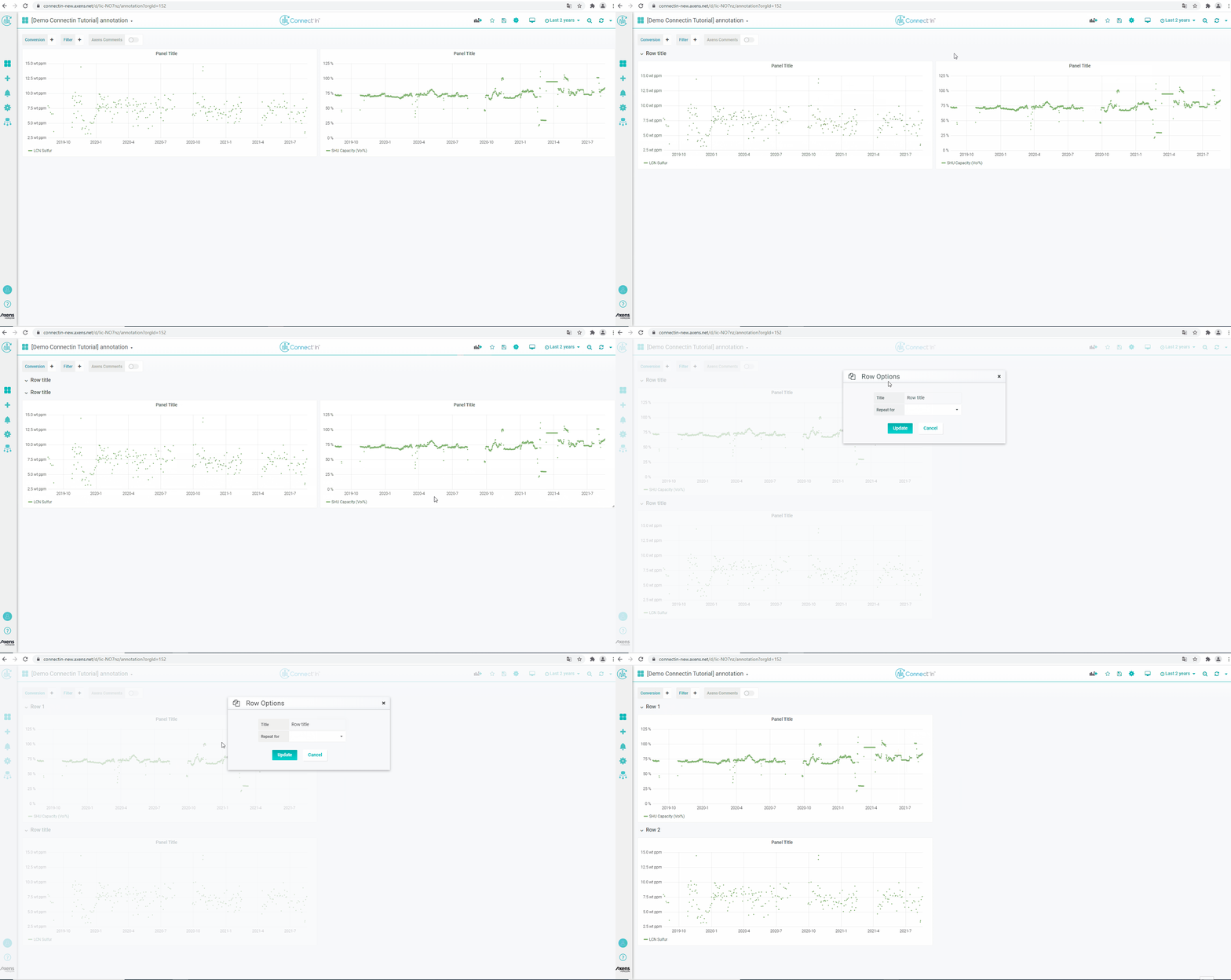
To organize panels into sections, one can use "Rows" object.
Click on the "Add Panel" icon located on the upper right hand corner. In the New Panel box, click on "Convert to Row". This creates a expandable section header. You will be asked to give a name the section. You can add panels to these sections by dragging the panels into different sections.
Add a Link to a Dashboard
To add link to any panel, copy the link of the dashboard or full view panel you want the link to redirect to.
In the panel you want the link to appear, click on "General" settings of a panel. In the Panel Links section, click on "Add Link" and paste the link in the URL field.

Shared Tooltips
Then looking at time series graphs on the same dashboard, it may be useful to have the tooltip displayed on the same time across different panels. This is called shared tooltip.To add link to any panel, copy the link of the dashboard or full view panel you want the link to redirect to.
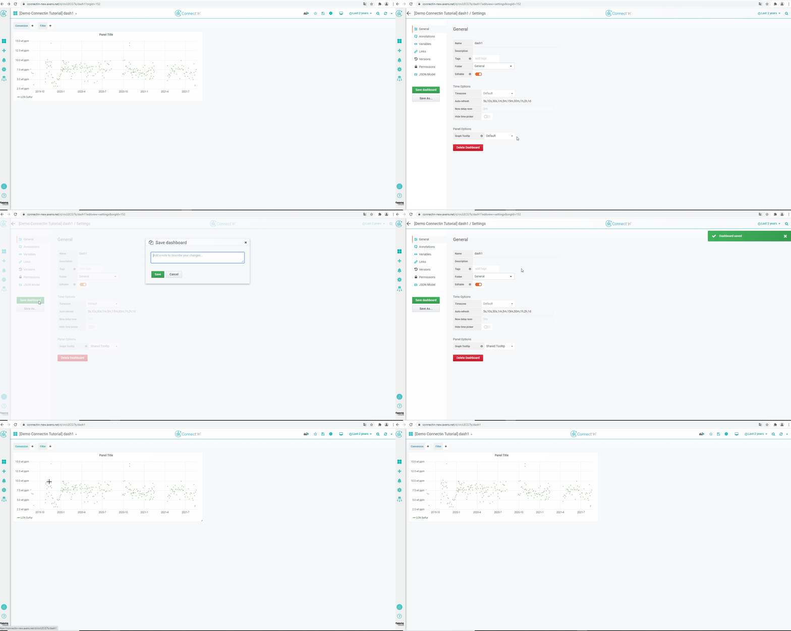
To enable a shared tooltip, click on the dashboard settings (gear button on the upper right hand corner). In the General settings tab, there is a section dedicated to Panel Options. The dropdown next to "Graph Tooltip" have options of default, shared tooltip, and shared crosshair.
- Default : No shared tooltip or crosshair.
- Shared crosshair : a vertical line is shown across different panels, but not tooltip showing the values of the data.
- Shared tooltip: a vertical line and a box showing the data values will be displayed across all the time-series graphs in the dashboard.
