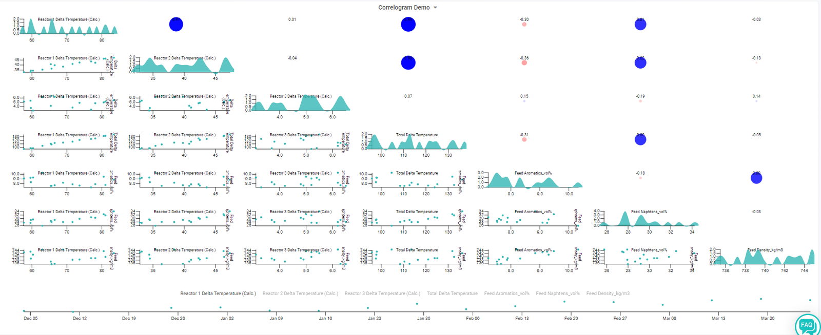
Axens Correlogram
This tutorial page will guide you through the creation, deployment and usage of a correlogram on Connect'In.
What is a Correlogram?
A correlogram is a graph of a correlation matrix.
It is very useful to highlight the most correlated variables in a dataset.
Correlation coefficients are coloured according to the value given between -1 and 1, typically using the Pearson Correlation Coefficient.
Highly positively correlated variables are close to 1 whilst highly negatively correlated variables are close to -1. Variables with limited to no correlation are close to 0.

What is the Pearson Correlation Coefficient?
The Pearson correlation coefficient is a measure of linear correlation between two sets of data.
It is the ratio between the covariance of two variables and the product of their standard deviations; thus, it is essentially a normalized measurement of the covariance, such that the result always has a value between −1 and 1.
As with covariance itself, the measure can only reflect a linear correlation of variables, and ignores many other types of relationships or correlations.

Typical Strength of Association:
- Small : 0.1 to 0.3
- Medium : 0.3 to 0.5
- Large : 0.5 to 1.0

What is the Axens Correlogram?
Axens Correlogram is a Connect'In plugin developed by Axens.
It allows users to analyse data in a no code environment.
Data Exploration Example
Let's take the reforming process as an example dataset.
Our target is to identify reactor operating changes that occur when the feed composition changes (naphtha aromatic and naphthene content).
First we need to set-up the correlogram in Connect'In...
Note: remember is it always very important to filter the data before hand to remove outliers and shut down periods. An example filter to use could be: Unit Capacity > 75%.


Analysing the Correlogram with Process Knowledge
The correlogram is separated into two sections:
- The lower diagonal is the XY plots of each variable.
- The upper diagonal is the correlation values.
- The diagonal down the centre is a histogram of each individual variable.
The correlogram read by using the chart key (labels - diagonally downwards from left to right) to match the data displayed. For example: feed napthenes has a strong positive correlation with Reactor 1 delta temperature (+0.81)
Let's take a look at the major correlations identified:
Feed napthenes has a strong positive correlation with reactor 1 delta temperature, reactor 2 dT and the total reactor dT but not reactor 3 dT.
This makes sense as the naphthenes in the feed react very quickly (quick endothermic reaction) hence the strong correlation to reactors 1 and 2 dT.
Feed aromatic content has a strong correlation with the feed density.


What if my correlations don't make physical sense?
1) Plot the data your trying to find a correlation with. By plotting the data on a time series graph you will most likely see the problem.
2) Check that your data filters are adequate - is there rogue points in your data?
3) Check to ensure the data you are exploring is not propagated. This can skew your correlations.
4) Is it possible that your relationship is not linear?


